Pyedra’s Tutorial
This tutorial is intended to serve as a guide for using Pyedra to analyze asteroid phase curve data.
Imports
The first thing we will do is import the necessary libraries. In general you will need the following: - pyedra (pyedra) is the library that we present in this tutorial. - pandas (pandas) this library will allow you to import your data as a dataframe.
Note: In this tutorial we assume that you already have experience using these libraries.
[1]:
import pyedra
import pandas as pd
Upload the data
The next thing we have to do is load our data. Pyedra should receive a dataframe with three columns: id (MPC number of the asteroid), alpha (\(\alpha\), phase angle) and v (reduced magnitude in Johnson’s V filter). You must respect the order and names of the columns as they have been mentioned. In this step we recommend the use of pandas:
df = pd.read_csv('somefile.csv')
For this tutorial we will use a preloaded data set offered by Pyedra.
[2]:
df = pyedra.datasets.load_carbognani2019()
Here we show you the structure that your data file should have. Note that the file can contain information about many asteroids, which allows to obtain catalogs of the parameters of the phase function for large databases.
[3]:
df
[3]:
| id | alpha | v | |
|---|---|---|---|
| 0 | 85 | 0.89 | 7.62 |
| 1 | 85 | 1.18 | 7.67 |
| 2 | 85 | 2.07 | 7.82 |
| 3 | 85 | 5.11 | 8.01 |
| 4 | 85 | 16.24 | 8.48 |
| 5 | 85 | 17.49 | 8.53 |
| 6 | 85 | 21.24 | 8.66 |
| 7 | 208 | 0.64 | 9.20 |
| 8 | 208 | 1.01 | 9.24 |
| 9 | 208 | 1.74 | 9.39 |
| 10 | 208 | 3.75 | 9.69 |
| 11 | 208 | 11.85 | 9.73 |
| 12 | 208 | 17.28 | 9.97 |
| 13 | 208 | 19.18 | 9.99 |
| 14 | 236 | 0.86 | 8.28 |
| 15 | 236 | 1.27 | 8.17 |
| 16 | 236 | 1.95 | 8.22 |
| 17 | 236 | 6.39 | 8.82 |
| 18 | 236 | 9.77 | 8.73 |
| 19 | 236 | 10.69 | 8.78 |
| 20 | 236 | 22.14 | 9.12 |
| 21 | 236 | 24.72 | 9.16 |
| 22 | 306 | 5.45 | 9.18 |
| 23 | 306 | 5.83 | 9.17 |
| 24 | 306 | 6.34 | 9.21 |
| 25 | 306 | 8.00 | 9.28 |
| 26 | 306 | 16.03 | 9.61 |
| 27 | 306 | 21.23 | 9.60 |
| 28 | 306 | 22.85 | 9.69 |
| 29 | 313 | 0.57 | 8.94 |
| 30 | 313 | 0.99 | 9.06 |
| 31 | 313 | 4.74 | 9.21 |
| 32 | 313 | 8.37 | 9.41 |
| 33 | 313 | 10.50 | 9.54 |
| 34 | 313 | 20.33 | 9.86 |
| 35 | 338 | 1.54 | 8.74 |
| 36 | 338 | 3.86 | 8.93 |
| 37 | 338 | 10.89 | 9.49 |
| 38 | 338 | 18.93 | 9.85 |
| 39 | 338 | 19.25 | 9.77 |
| 40 | 522 | 2.00 | 9.23 |
| 41 | 522 | 2.19 | 9.28 |
| 42 | 522 | 4.07 | 9.36 |
| 43 | 522 | 4.99 | 9.41 |
| 44 | 522 | 7.40 | 9.55 |
| 45 | 522 | 13.67 | 9.85 |
| 46 | 522 | 16.24 | 9.88 |
Fit your data
Pyedra’s main objective is to fit a phase function model to our data. Currently the api offers three different models:
HG_fit(H, G model): \(V(\alpha)=H-2.5log_{10}[(1-G)\Phi_{1}(\alpha)+G\Phi_{2}(\alpha)]\)Shev_fit(Shevchenko model): \(V(1,\alpha)=V(1,0)-\frac{a}{1+\alpha}+b\cdot\alpha\)HG1G2_fit(H, G\(_1\), G\(_2\) model): \(V(\alpha) = H-2.5log_{10}[G_{1}\Phi_{1}(\alpha)+G_{2}\Phi_{2}(\alpha)+(1-G_{1}-G_{2})\Phi_{3}(\alpha)]\)
We will now explain how to apply each of them. At the end of this tutorial you will notice that they all work in an analogous way and that their implementation is very simple.
HG_fit
Let’s assume that we want to fit the biparametric model H, G to our data set. What we will do is invoke Pyedra’s HG_fit function:
[4]:
HG = pyedra.HG_fit(df)
We have already created our catalog of H, G parameters for our data set. Let’s see what it looks like.
[5]:
HG
[5]:
| id | H | error_H | G | error_G | R | |
|---|---|---|---|---|---|---|
| 0 | 85 | 7.492423 | 0.070257 | 0.043400 | 0.035114 | 0.991422 |
| 1 | 208 | 9.153433 | 0.217270 | 0.219822 | 0.097057 | 0.899388 |
| 2 | 236 | 8.059719 | 0.202373 | 0.104392 | 0.094382 | 0.914150 |
| 3 | 306 | 8.816185 | 0.122374 | 0.306459 | 0.048506 | 0.970628 |
| 4 | 313 | 8.860208 | 0.098102 | 0.170928 | 0.044624 | 0.982924 |
| 5 | 338 | 8.465495 | 0.087252 | -0.121937 | 0.048183 | 0.992949 |
| 6 | 522 | 8.992164 | 0.063690 | 0.120200 | 0.028878 | 0.991757 |
R is the coefficient of determination of the fit
All pandas dataframe options are available. For example, you may be interested in knowing the mean H of your sample. To do so:
[6]:
HG.H.mean()
[6]:
8.54851801238607
Remeber that HG.H selects the H column.
[7]:
HG.H
[7]:
0    7.492423
1    9.153433
2    8.059719
3    8.816185
4    8.860208
5    8.465495
6    8.992164
Name: H, dtype: float64
The PyedraFitDataFrame can also be filtered, like a canonical pandas dataframe. Let’s assume that we want to save the created catalog, but only for those asteroids whose id is less than t300. All we have to do is:
[8]:
filtered = HG.model_df[HG.model_df['id'] < 300]
filtered
[8]:
| id | H | error_H | G | error_G | R | |
|---|---|---|---|---|---|---|
| 0 | 85 | 7.492423 | 0.070257 | 0.043400 | 0.035114 | 0.991422 |
| 1 | 208 | 9.153433 | 0.217270 | 0.219822 | 0.097057 | 0.899388 |
| 2 | 236 | 8.059719 | 0.202373 | 0.104392 | 0.094382 | 0.914150 |
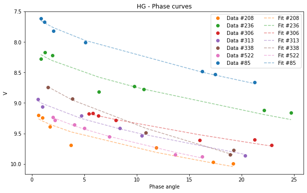
Finally we want to see our data plotted together with their respective fits. To do this we will use the .plot function provided by Pyedra. To obtain the graph with the adjustments of the phase function model we only have to pass to .plot the dataframe that contains our data in the following way:
[9]:
HG.plot(df=df)
[9]:
<AxesSubplot:title={'center':'HG - Phase curves'}, xlabel='Phase angle', ylabel='V'>
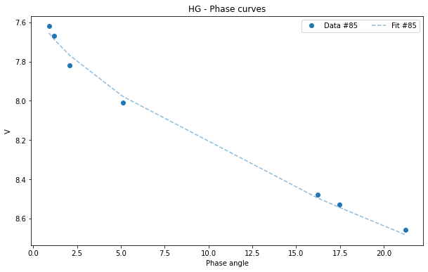
If your database is very large and you want a clearer graph, or if you only want to see the fit of one of the asteroids you can filter your initial dataframe.
[10]:
asteroid_85 = df[df['id'] == 85]
HG_85 = pyedra.HG_fit(asteroid_85)
HG_85.plot(df = asteroid_85)
[10]:
<AxesSubplot:title={'center':'HG - Phase curves'}, xlabel='Phase angle', ylabel='V'>
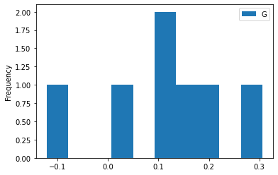
All pandas plots are available if you want to use any of them. For example, we may want to visualize the histogram of one of the parameters:
[11]:
HG.plot(y='G', kind='hist')
[11]:
<AxesSubplot:ylabel='Frequency'>
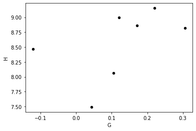
Or we may want to find out if there is a correlation between parameters:
[12]:
HG.plot(x='G', y='H', kind='scatter', marker='o', color='black')
[12]:
<AxesSubplot:xlabel='G', ylabel='H'>
Everything we have done in this section can be extended in an analogous way to the rest of the models, as we will see below.
HG1G2_fit
Now we want to adjust the H, G\(_1\), G\(_2\) model to our data. Use the function HG1G2_fit in the following way.
[13]:
HG1G2 = pyedra.HG1G2_fit(df)
HG1G2
[13]:
| id | H12 | error_H12 | G1 | error_G1 | G2 | error_G2 | R | |
|---|---|---|---|---|---|---|---|---|
| 0 | 85 | 7.398776 | 0.162316 | 0.303790 | 0.081963 | 0.236331 | 0.062360 | 0.996285 |
| 1 | 208 | 8.904819 | 0.326344 | -0.393842 | 0.320769 | 0.709746 | 0.190495 | 0.976405 |
| 2 | 236 | 7.901036 | 0.558052 | 0.043248 | 0.361217 | 0.413350 | 0.237267 | 0.934118 |
| 3 | 306 | 8.224509 | 1.238547 | -0.041959 | 0.529741 | 0.367042 | 0.443392 | 0.968671 |
| 4 | 313 | 8.883195 | 0.347260 | 0.661550 | 0.161242 | 0.127482 | 0.154199 | 0.984322 |
| 5 | 338 | 8.450968 | 0.391477 | 0.691141 | 0.194887 | -0.070232 | 0.173648 | 0.991939 |
| 6 | 522 | 9.046202 | 0.213791 | 0.705920 | 0.107933 | 0.088499 | 0.087300 | 0.992124 |
R is the coefficient of determination of the fit.
We can calculate, for example, the median of each of the columns:
[14]:
HG1G2.median()
[14]:
id           306.000000
H12            8.450968
error_H12      0.347260
G1             0.303790
error_G1       0.194887
G2             0.236331
error_G2       0.173648
R              0.984322
dtype: float64
Again, we can filter our catalog. We are keeping the best settings, that is, those whose R is greater than 0.98.
[15]:
best_fits = HG1G2.model_df[HG1G2.model_df['R'] > 0.98]
best_fits
[15]:
| id | H12 | error_H12 | G1 | error_G1 | G2 | error_G2 | R | |
|---|---|---|---|---|---|---|---|---|
| 0 | 85 | 7.398776 | 0.162316 | 0.303790 | 0.081963 | 0.236331 | 0.062360 | 0.996285 |
| 4 | 313 | 8.883195 | 0.347260 | 0.661550 | 0.161242 | 0.127482 | 0.154199 | 0.984322 |
| 5 | 338 | 8.450968 | 0.391477 | 0.691141 | 0.194887 | -0.070232 | 0.173648 | 0.991939 |
| 6 | 522 | 9.046202 | 0.213791 | 0.705920 | 0.107933 | 0.088499 | 0.087300 | 0.992124 |
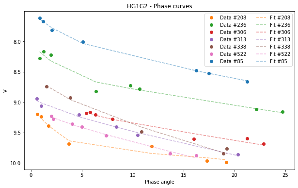
We will now look at the graphics.
[16]:
HG1G2.plot(df=df)
[16]:
<AxesSubplot:title={'center':'HG1G2 - Phase curves'}, xlabel='Phase angle', ylabel='V'>
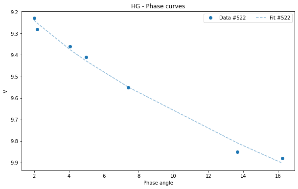
If we want to visualize the graph only of the asteroid (522):
[17]:
asteroid_522 = df[df['id'] == 522]
HG1G2_522 = pyedra.HG_fit(asteroid_522)
HG1G2_522.plot(df=asteroid_522)
[17]:
<AxesSubplot:title={'center':'HG - Phase curves'}, xlabel='Phase angle', ylabel='V'>
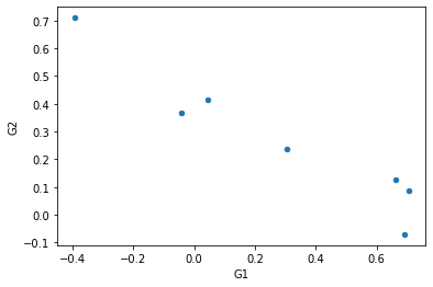
To see the correlation between the parameters G\(_1\) and G\(_2\) we can use the “scatter” graph of pandas:
[18]:
HG1G2.plot(x='G1', y='G2', kind='scatter')
[18]:
<AxesSubplot:xlabel='G1', ylabel='G2'>
Shev_fit
If we want to adjust the Shevchenko model to our data, we must use Shev_fit.
[19]:
Shev = pyedra.Shev_fit(df)
Shev
[19]:
| id | V_lin | error_V_lin | b | error_b | c | error_c | R | |
|---|---|---|---|---|---|---|---|---|
| 0 | 85 | 7.957775 | 0.022576 | 0.696826 | 0.051010 | 0.034637 | 0.001184 | 0.999542 |
| 1 | 208 | 9.738767 | 0.146121 | 0.945126 | 0.300105 | 0.014448 | 0.008524 | 0.960483 |
| 2 | 236 | 8.626281 | 0.166623 | 0.916350 | 0.402758 | 0.023646 | 0.008515 | 0.932592 |
| 3 | 306 | 9.600553 | 0.275835 | 3.231009 | 1.549868 | 0.009097 | 0.010083 | 0.975662 |
| 4 | 313 | 9.132444 | 0.071010 | 0.297612 | 0.140332 | 0.037097 | 0.004712 | 0.988686 |
| 5 | 338 | 9.003280 | 0.216194 | 0.900765 | 0.623240 | 0.045328 | 0.011141 | 0.985846 |
| 6 | 522 | 9.292723 | 0.084461 | 0.392058 | 0.267625 | 0.039625 | 0.005236 | 0.989935 |
R is the coefficient of determination of the fit.
We can select a particular column and calculate, for example, its minimum:
[20]:
Shev.V_lin
[20]:
0    7.957775
1    9.738767
2    8.626281
3    9.600553
4    9.132444
5    9.003280
6    9.292723
Name: V_lin, dtype: float64
[21]:
Shev.V_lin.min()
[21]:
7.9577754899895226
And obviously we can graph the resulting fit:
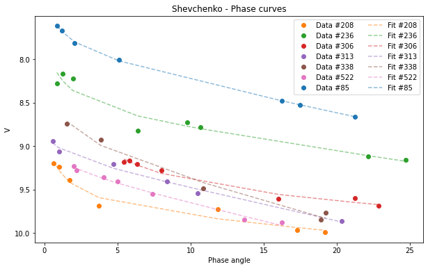
[22]:
Shev.plot(df=df)
[22]:
<AxesSubplot:title={'center':'Shevchenko - Phase curves'}, xlabel='Phase angle', ylabel='V'>
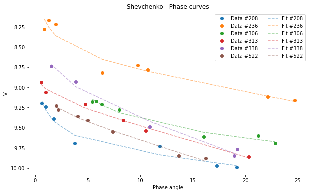
Selecting a subsample:
[23]:
subsample = df[df['id'] > 100 ]
Shev_subsample = pyedra.Shev_fit(subsample)
Shev_subsample.plot(df=subsample)
[23]:
<AxesSubplot:title={'center':'Shevchenko - Phase curves'}, xlabel='Phase angle', ylabel='V'>
We can use some of the pandas plot.
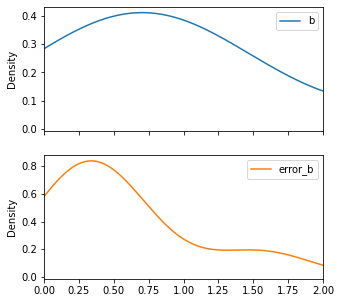
[24]:
Shev_subsample.plot(y=['b', 'error_b'], kind='density', subplots=True, figsize=(5,5), xlim=(0,2))
[24]:
array([<AxesSubplot:ylabel='Density'>, <AxesSubplot:ylabel='Density'>],
      dtype=object)